Squarespace CTA Buttons: What to Write and Where to Put Them
If you liked this, Pin to Pinterest, or save for later.
Your Squarespace website CTA buttons.
Those little clickable prompts asking visitors to do something might be the most overlooked part of your website. And yet, they're doing one of the most important jobs on the page. If visitors aren't enquiring, booking, or signing up, there's a decent chance your Squarespace call-to-action buttons are letting you down. In this blog post, we'll cover:
What a website CTA button actually is (and why it matters)
The most common web CTA button mistakes on small business websites
How to write button copy/words that connect and convert
Design tips to make your buttons impossible to miss
Squarespace-specific tips to get it right on your site
Think of it this way: your website can be beautiful, your copy can be stellar — but if your buttons don't guide visitors to take the next step, all of that good work quietly slips away. 🍃
Feeling stuck with your website? Take a look at my The Bespoke Website Package or my other services.
What Is a CTA Button, Anyway?
A CTA button — short for call to action — is a clickable element on your website that tells a visitor what to do next.
Think: "Book a Call", "Get in Touch", "Download the Guide", "See My Work."
It sounds simple. And it is. But the words you choose, where you place your buttons, and how they look? That's where the magic (or the mess) happens.
Why This Matters More Than You Think
Here's a stat worth sitting with:
“Companies that use personalised CTAs convert 202% better than those with basic CTAs.”
Your button isn't just a design detail. It's a conversion tool — the bridge between a visitor mooching around your site and them actually getting in touch to work with you.
And over and over again, when I carry out a website audit for a client, CTA buttons are one of the first things I flag.
They're either:
Buried at the bottom of the page
Saying something vague like "Click Here" 🫠
Blending in with the background (not in a good way)
Or there are so many competing buttons, the visitor doesn't know where to look
Sound familiar? Right then — let's sort it.
Go here if you’re considering pro website design vs. DIY.
The Most Common CTA Button Mistakes on Small Business Websites
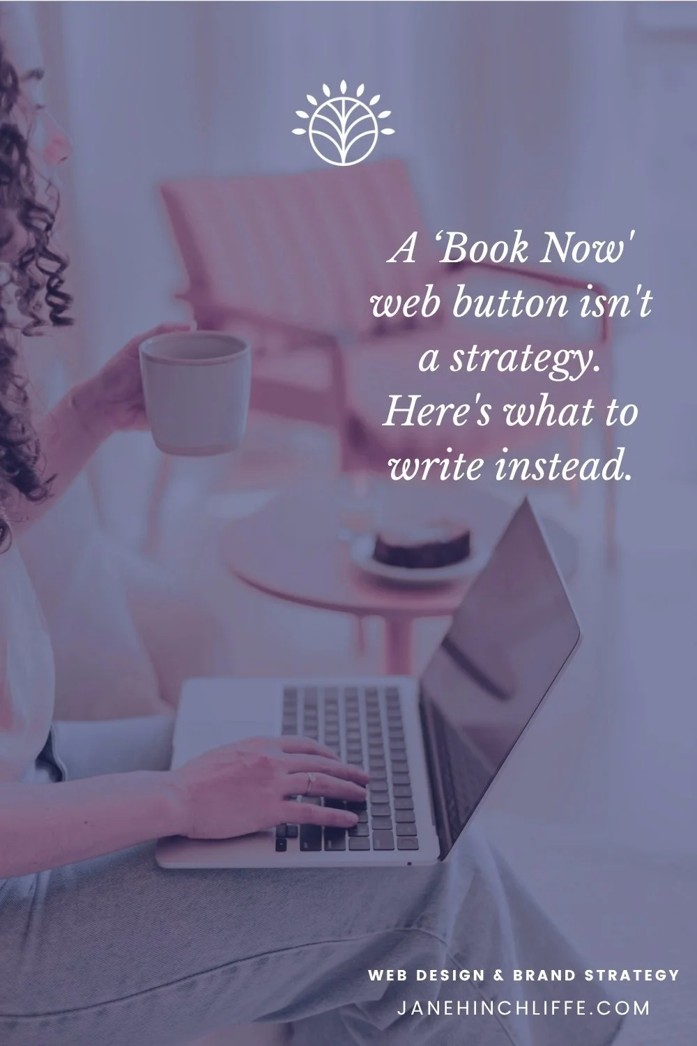
1. Vague button web copy
"Submit." "Click here." "Learn more." These don't tell your visitor what they're getting or why they should bother. They're a bit meh, honestly.
2. Too many CTAs fighting for attention
If every section has a different button pointing somewhere different, visitors get overwhelmed. And overwhelmed visitors? They leave.
3. Poor colour contrast
If your button blends into the background, it's practically invisible. This is also an accessibility issue — a really important one. (More on this below.)
4. No CTA above the fold
"Above the fold" means the part of the page visible before you scroll. If there's no button up there, you're missing the moment visitors are most engaged.
5. Button text written for you, not your visitor
"My Services" is written from your perspective. "See How I Can Help" is written from theirs. Small shift. Big difference.
6. Button types on Squarespace - The golden rule for all three
One page should never have three buttons of equal visual weight competing for attention. The hierarchy has to be clear:
Primary shouts 📣 — Typically, solid-filled, bold colour. Your main CTA — the action you most want taken
Secondary speaks 🗣️ — Typically, outlined / ghost style. A softer alternative action on the same page
Tertiary whispers 🤫 — Often plain text with an arrow or underline. The quietest nudge — a "there if you want it" option
If everything shouts, nothing gets heard — and your visitor freezes instead of clicking anything. Which is the last thing you want.
You may want to read this blog post: Squarespace website for life coaches.
How to Write CTA Button Copy That Actually Works
This is where most people go wrong — they default to what feels easy rather than what works. Here's a simple framework:
The formula: Verb + Outcome (+ Reassurance if needed)
So instead of:
"Contact" → try "Let's Chat About Your Website"
"Book Now" → try "Book Your Free Strategy Call"
"Services" → try "See How I Can Help You"
"Download" → try "Grab Your Free SEO Checklist"
The verb gets them moving.
The outcome tells them what's in it for them.
The reassurance (like "free", "no obligation", "in 2 minutes") removes the wobble.
A few tried-and-tested examples:
"Start Your Website Transformation"
"Book a No-Obligation Chat"
"Get My Free Website Audit"
"See What's Possible"
"Let's Build Something Lush" 🙋♀️
CTA Button Design Tips: Make Them Impossible to Miss
Your button copy can be brilliant, but if the button itself is hard to spot, it won't matter. Here's what to check:
Colour contrast ✅
Your button colour needs to stand out from the background — not in a clashing, headache-inducing way, but with enough contrast that it's immediately visible.
This is also about accessibility: people with visual impairment, colour blindness, or those that use a keyboard (rather than a mouse), need good contrast to navigate your site confidently.
I've written a full guide on web colour contrast here — worth a read if you're unsure.
As a rule of thumb, use a contrast ratio of at least 4.5:1 for button text (this is the WCAG AA standard — the Web Content Accessibility Guidelines, basically the gold standard for accessible web design). Try the free WEBAIM contrast checker.
You may like this blog post from Nielsen Norman Group, an ux authority on using Learn More Links, You Can Do Better.
Size and padding 📐
Buttons need to be big enough to tap on a mobile.
If someone's on their phone (and probs most of your visitors are), a tiny button can be a proper nightmare to tap. Give it breathing room — padding around the text makes it feel more clickable.
Placement 📍
Your primary CTA should appear:
In your navigation (a sticky button works brilliantly here)
Above the fold on your homepage
After every major section of a service or about page
At the end of every blog post
You don't need a button every three lines — that's overwhelming. But strategic repetition? That's a no-brainer.
Hierarchy 🗂️
If you have more than one CTA on a page, make one the primary (bolder, more prominent) and one the secondary (outlined or softer).
This guides visitors toward the action you most want them to take, without confusing them.
Squarespace CTA Button Tips 🟫
If you're on Squarespace (which, let's be honest, you probably are if you're reading this 😄), here's how to make the most of your buttons:
1. Use the Button Block intentionally
Squarespace has a dedicated button block.
When it makes sense, use a button rather than hyperlinking text — it's more clickable, more accessible, and easier to style consistently.
2. Customise button styles in the Design Panel
Go to Design > Site Styles to set your global button style, including font, border radius, etc. In addition, for each theme, tweak the colour.
Get this right once, and it applies across your whole site. Mega time-saver.
3. Add a sticky header button
In Squarespace 7.1, you can add a button directly into your header/navigation (right-hand side) so it follows visitors as they scroll.
This is one of the highest-converting spots on your entire site — don't waste it with "Home."
4. Use different button styles for primary vs. secondary vs. tertiary CTAs
Squarespace lets you apply "Primary", "Secondary" and “Tertiary” button styles to give a clear visual hierarchy.
Use a filled button for your main action, an outline button for a softer secondary option, and a minimal look for tertiary.
5. Test on mobile
Always preview your pages on mobile in Squarespace before publishing.
Buttons stack differently, and what looks fab on desktop can be a bit of a situation on a phone.
6. Link to your contact page — consistently
If your website goal is to get enquiries via your contact form (which it should be, for most service-based businesses), make sure at least one CTA on every key page links directly there. Not to a services page. To the form.
Speaking of which, I have a full guide to Squarespace forms here if you want to make sure yours is doing its job properly. 📝
Bonus: What About CTAs for Your Email List and Booking System?
Not every CTA sends people to a contact form. Sometimes you want them to:
Book a call directly — tools like Acuity Scheduling or Cal.com make this beautifully seamless (affiliate links — I only ever recommend tools I genuinely use or rate)
Join your email list — platforms like Kit or Flodesk make it easy to embed a sign-up form with a strong CTA
Download a freebie — pair a great lead magnet with a button that tells them exactly what they'll get
The principle is the same across all of these: be specific, be outcome-focused, and make the next step feel easy.
FAQ: CTA Buttons for Small Business Websites
-
Aim for one primary CTA (your main goal — usually "Get in Touch" or "Book a Call") repeated 2–3 times across the page.
You can have a softer secondary CTA (like "See My Work" or "Read the Blog") in between, but keep the hierarchy clear.
-
Use a colour that contrasts with your background — ideally, your brand accent colour. The most important thing is that it stands out and passes accessibility contrast checks. Run it through WebAIM's Contrast Checker to be sure.
-
Absolutely. Research consistently shows that specific, action-led copy ("Start My Free Trial") outperforms generic copy ("Submit") by a significant margin.
Don't underestimate the power of a few words.
-
"Contact Me" is fine, but there are more compelling options. "Let's Talk," "Book a Free Chat," or "Start Your Project" all feel warmer and more outcome-led.
Think about what your visitor is hoping to get — and let that lead the copy.
-
Yes! In fact, you should. Primary CTAs (your main ask) and secondary CTAs (softer next steps like downloading a guide or reading a blog post) work well together.
Just make sure the primary is visually dominant.
-
Go to Design > Site Styles in your Squarespace editor. Scroll to "Buttons" and update your primary and secondary button styles.
If you're not sure how, I'm here to help — a 90-minute Squarespace Help Call might be just the thing. 🙂
🌿 What Next?
Your website CTA buttons are not just little design details. They're the nudge your visitor needs to take the next step — and if they're vague, buried, or invisible, you're letting potential enquiries slip through your fingers unnecessarily.
The good news? This is one of the quickest wins on your website. You don't need a full redesign. Just:
✅ Write specific, outcome-focused button copy
✅ Check your colour contrast for accessibility
✅ Place buttons strategically — especially above the fold
✅ Keep one clear primary CTA per page
✅ Test everything on mobile
As Donald Miller puts it in Building a Story Brand: "If you confuse, you lose." Your CTA is the moment of clarity — don't muddy it.
If you'd love a fresh pair of eyes on your website — including those buttons — my Pro Website Audit with Strategy is a brilliant place to start. I'll tell you exactly what's working, what isn't, and what to do about it. Pinky promise.
Disclosure: This blog post contains affiliate links. If you click through and make a purchase, I'll be compensated at no cost to you.
Here are some of my favourite business tools, apps, services and brands that I genuinely use, have on my list to purchase or recommend to clients.
Thanks 🌟 for being here, and if you’d like more tips, tools, and tricks [without the overwhelm], to help YOU grow your small business, I’d love to have you join my twice-monthly HeartBiz 💌 Letter.
Go here for my Free Web Resource downloads.