Web Colour Contrast: Your Accessibility Guide
If you liked this, Pin to Pinterest, or save for later.
Why Web Colour Contrast Accessibility Matters (And How to Get It Right)
Your Guide to Creating Accessible Squarespace Websites That Everyone Can Read.
Picture this: you've poured your heart into creating a gorgeous website. The design is stunning, your brand colours pop brilliantly on screen, and you're absolutely chuffed with how it looks. But then someone tells you they can't actually read half of your content. Woopsie.
This is the reality for millions of people when websites don't have proper colour contrast. And it's not just affecting folks with visual impairments—it impacts everyone trying to read your site in bright sunlight, on older screens, or simply after a long day when their eyes are tired.
According to WebAIM's 2024 analysis, colour contrast issues affect a staggering 81% of all homepages on websites, making it the number one accessibility violation on the web. That means if your website has contrast problems, you're in the majority—but that's not somewhere you want to be.
In this post, we’ll cover:
What colour contrast actually is and why it's bloody important
WCAG guidelines explained in plain English (no jargon, promise)
How to check your Squarespace website's contrast ratios
Practical tips that go beyond the basics (things most people overlook)
Step-by-step instructions for fixing contrast issues in Squarespace
Real examples and tools you can use right now
Need help? Visit my Work With Me page
“Accessibility is about removing barriers, not removing design.”
What Is Colour Contrast? (And Why Should You Care?)
Colour contrast is simply the difference in brightness between your text and its background.
Think of it like this:
If you were to take a black-and-white photo of your website, would you still be able to read everything clearly? That's essentially what we're talking about.
This brightness difference is measured as a contrast ratio—a number that ranges from 1:1 (no contrast at all, like white text on a white background) to 21:1 (maximum contrast, like black text on white).
Who Actually Benefits from Good Contrast?
The short answer? Everyone.
People with low vision or moderate visual impairments
Peeps with colour blindness (affecting roughly 1 in 12 men and 1 in 200 women)
Anyone over 40 experiencing natural age-related vision changes
People viewing your site on their phone in bright sunlight
Users with older or cheaper screens that don't display colours as vibrantly
Literally anyone who's tired, stressed, or dealing with eye strain
According to WCAG, approx 15% of the US population is currently 65 or older, and that number is growing. As we age, contrast sensitivity naturally decreases. The 4.5:1 ratio recommended by WCAG is designed to compensate for vision loss equivalent to roughly 20/40, which many of us experience as we get older.
Understanding WCAG Guidelines (Without the Headache)
The Web Content Accessibility Guidelines (WCAG) are the international standards for web accessibility. They sound intimidating, but the colour contrast requirements are actually quite straightforward once you break them down.
The Magic Numbers You Need to Know
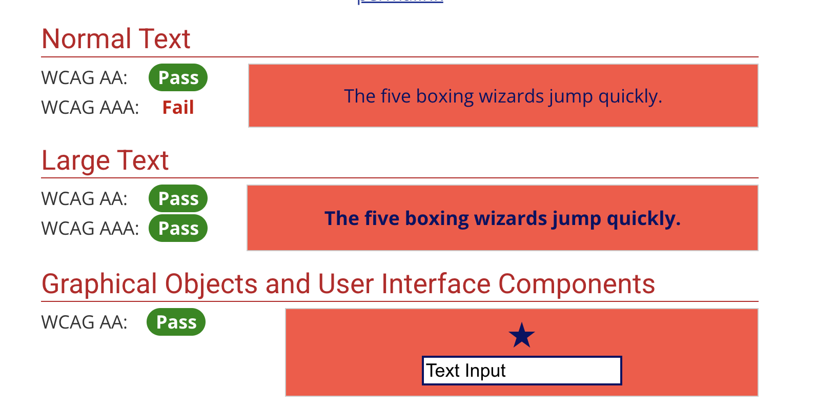
For WCAG Level AA (the standard most organisations aim for):
Normal text: Minimum contrast ratio of 4.5:1
Large text: Minimum contrast ratio of 3:1 (large text is 18pt/24px or 14pt/19px bold)
UI components and graphics: Minimum contrast ratio of 3:1 (buttons, form borders, icons)
For WCAG Level AAA (enhanced compliance):
Normal text: Minimum contrast ratio of 7:1
Large text: Minimum contrast ratio of 4.5:1
Important: You cannot round up to meet these requirements. A contrast ratio of 4.47:1 does not pass the 4.5:1 requirement, even though it's close. One commonly used shade of grey (#777777) has a ratio of 4.47:1 on white, which means it technically fails WCAG AA standards.
What About Brand Colours?
Here's something that surprises many people: there is no exception for brand colours. Whilst logos and brand names have some flexibility, your general website content must meet contrast requirements regardless of your brand guidelines. This can be a tad challenging to navigate, but it's not negotiable—and honestly, it's an opportunity to refine your colour palette to work better for everyone.
You might find this blog post helpful: Transforming your business by developing a brand identity.
How to Check Your Web Colour Contrast
Right then, let's get practical. Here are the best tools for checking your Squarespace website's colour contrast:
Essential Contrast Checking Tools
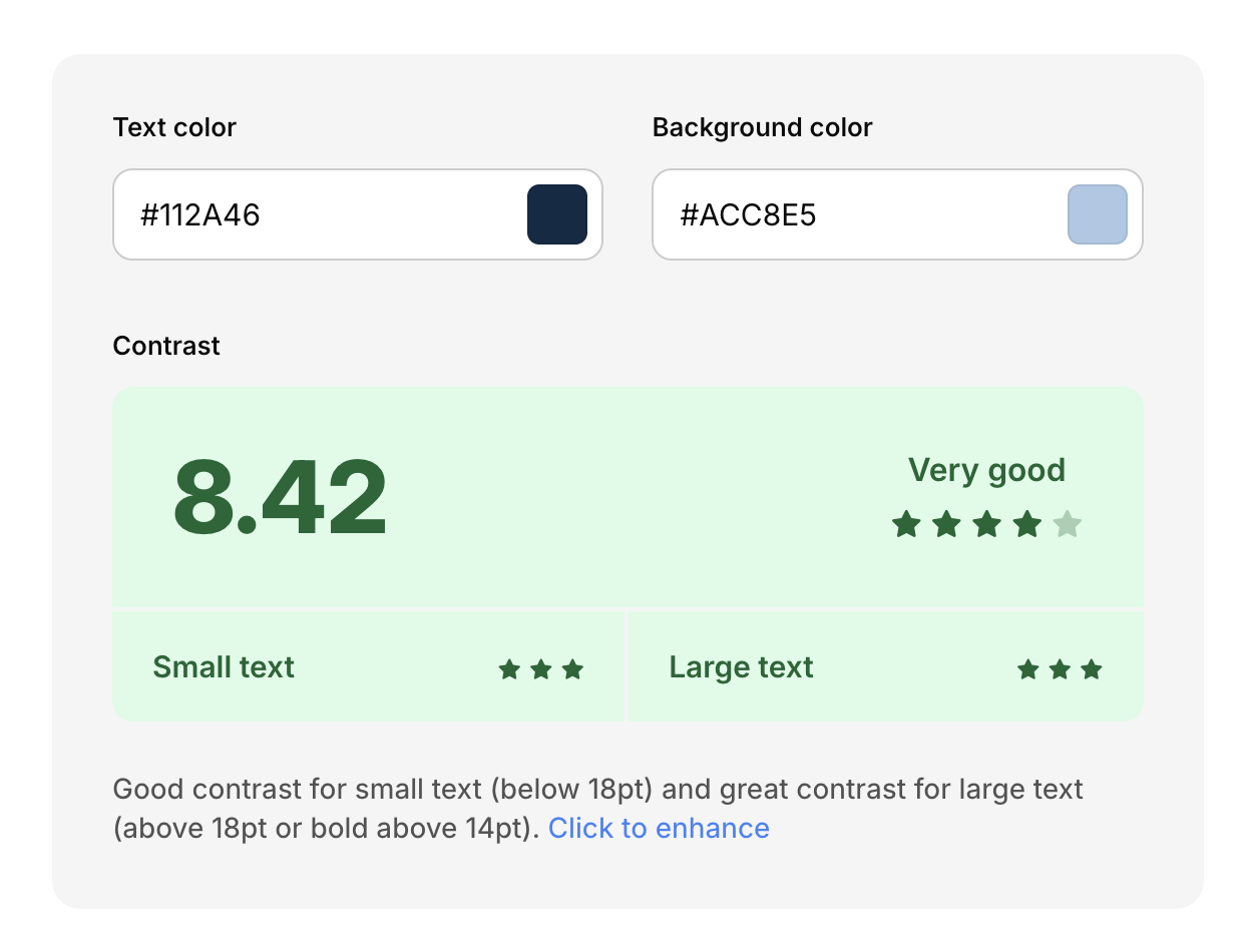
1. WebAIM Contrast Checker
This is the gold standard and absolutely free. You can enter colour values manually or use the eyedropper tool to pick colours directly from your screen. It instantly tells you whether your colour combination passes WCAG AA and AAA standards for both normal and large text.
Bonus: it even suggests similar colours that would pass if yours don't.
Screenshot showing WebAIM Contrast Checker in action
2. Coolors Contrast Checker*
If you click through and make a purchase, I'll be compensated at no cost to you.
Brilliant for when you're in the design phase. This tool not only checks contrast but also helps you visualise how your colours work together. It's particularly useful for building entire accessible colour palettes.
Coolors Web Colour Contrast checker example
3. Chrome DevTools (Built-in!)
Right-click any element on your website, select 'Inspect', then look at the Styles panel. Chrome will show you the contrast ratio right there, with a green tick if it passes or a warning if it doesn't. Absolutely game-changing for quick checks.
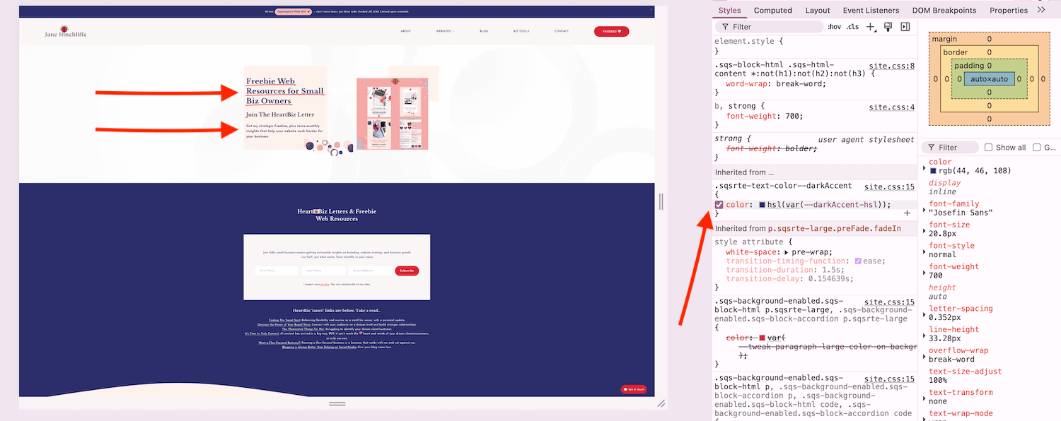
Screenshot of Chrome DevTools in action for web colour contrast
4. WAVE Browser Extension (by WebAIM)
This analyses your entire page at once and highlights contrast issues along with loads of other accessibility problems. It's like having an accessibility audit right in your browser.
Personal note: I find this to be sometimes inaccurate for colour contrast and prefer to use some of the other tools mentioned.
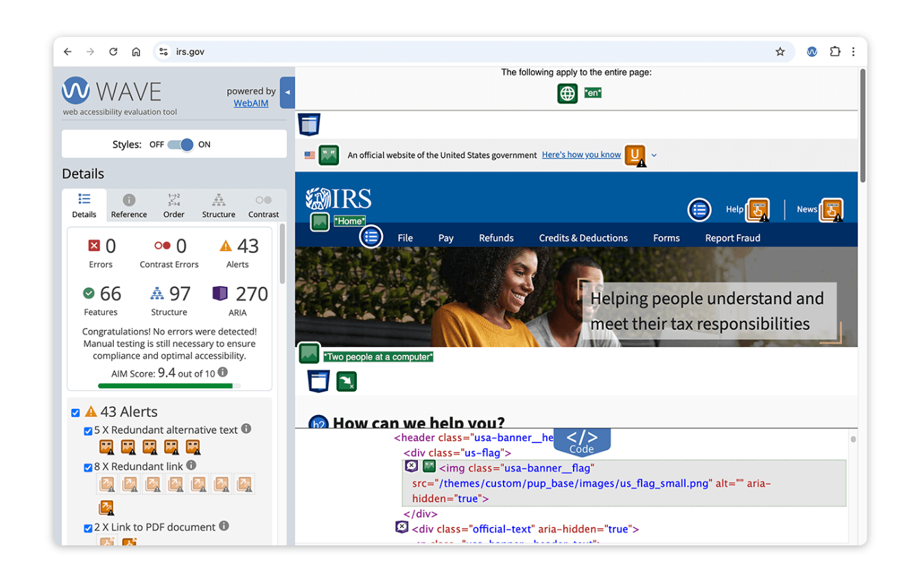
Screenshot of WAVE browser extension for web colour contrast and accessibility in action
5. Color Oracle (Free Desktop App)
This one's mega useful—it simulates different types of colour blindness (deuteranopia, protanopia, and tritanopia) so you can see exactly what your website looks like to people with colour vision deficiencies.
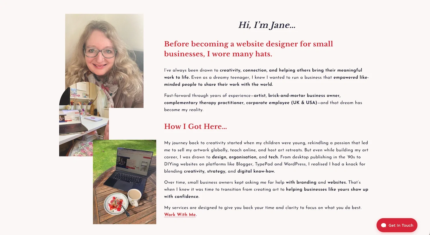
Example of Jane Hinchliffe about page with correct web colour contrast
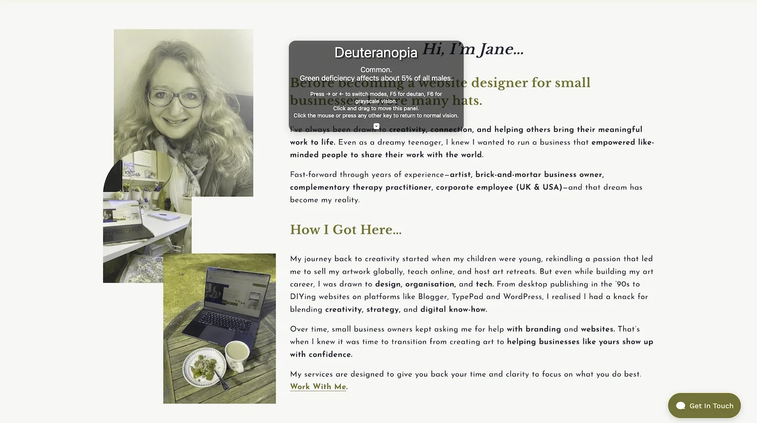
Color Oracle Tool in action with an example of how someone with colour blindness would see my about page and web colour contrast.
Step-by-Step: Checking Your Squarespace Site
Navigate to your live Squarespace website
Right-click on any text element and select 'Inspect' (see above)
Look at the Styles panel on the right—Chrome will show the contrast ratio (see above)
For a more thorough check, copy your text colour (usually listed as 'color' in CSS) and background colour
Paste these into the WebAIM Contrast Checker (see above)
Check the results—you want to see green ticks for WCAG AA (or AAA if you're being stellar)
Beyond the Basics: Contrast Tips Most People Miss
Right, here's where we get into the good stuff, the bits and pieces that most accessibility guides don't mention but can make a huge difference.
1. Text Over Images: A Potential Nightmare
Images with multiple colours create a real mess when it comes to contrast checking. Here's the thing: your text needs to have adequate contrast with every part of the image it overlaps.
Solutions:
Add a semi-transparent overlay behind your text (dark overlay for light text, light overlay for dark text)
Use text shadows strategically—a dark shadow around light text can significantly improve readability
Choose images with consistent, low-contrast backgrounds where you'll place text
In Squarespace, use banner sections with built-in overlay options—these are brilliant for maintaining good contrast
Example of my website with a transparent box behind text to meet accessibility and web colour contrast requirements.
2. Don't Rely on Colour Alone
This one trips people up constantly. Let's say you're using red text to indicate errors and green for success. What happens if someone can't distinguish between red and green? They're left guessing.
Better approach:
Combine colour with icons (✓ for success, ✗ for errors)
Add text labels ('Success!' or 'Error') not just colour coding
Use patterns or textures in addition to colour in charts and graphs
Example on my site of combining colour with a checkmark icon for web colour contrast accessibility.
3. Link Visibility: The 3:1 Rule You Might Not Know
Here's a lesser-known WCAG requirement: if you remove underlines from links (as many modern designs do), your link text needs two things:
At least 3:1 contrast ratio between the link colour and the surrounding body text
A visual cue (not just colour change) on hover and focus—this usually means adding an underline back on hover
My recommendation? Just keep the underlines. It's the most accessible option and actually helps with user experience. Everyone immediately knows it's a link—no confusion, no guessing.
Example of link visibility with web colour contrast. Here, the link isn’t underlined, but the colour contrast is such that accessibility isn’t an issue.
4. Form Field Borders and Buttons
WCAG 2.1 introduced a requirement that's often overlooked: UI components like form field borders and button outlines need a 3:1 contrast ratio against their background.
Think of it this way: if you're using a light grey border (#CCCCCC) on a white background, that's only about 1.6:1 contrast—which fails. You need a darker border colour, like #767676, which achieves a 3.5:1 ratio.
You might like this guide on using Squarespace forms.

Example of web colour contrast accessibility for forms - shows box with clear contrast to the sign-up background block.
5. The Transparency Trap
Using semi-transparent colours (like rgba(0,0,0,0.5))? The alpha value (that last number) reduces contrast because you're letting the background colour bleed through.
When checking contrast for transparent colours, you need to calculate what the final rendered colour will be when layered over its background. Tools like WebAIM's contrast checker have an 'alpha' slider specifically for this.
Fixing Contrast Issues in Squarespace: Your Action Plan

Squarespace has some built-in features to help with accessibility, but you'll need to take an active role. Here's how to address contrast issues:
Adjusting Your Site Styles
In your Squarespace editor, go to Design → Site Styles
Navigate to the Colours section
Review each colour pairing—text colours with their background colours
Use the WebAIM Contrast Checker to test each combination
Adjust colours as needed—often you only need to make subtle changes (slightly darker text or lighter backgrounds)
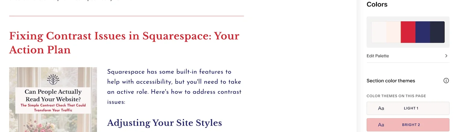
Screenshot showing Squarespace styles panel
Safe Colour Combinations to Start With
If you're not sure where to start, these combinations all pass WCAG AA standards:
Black (#000000) on white (#FFFFFF): 21:1 ratio—maximum contrast
Dark grey (#333333) on white: 12.6:1 ratio—passes AAA
White text on dark blue (#003366): 10.7:1 ratio—stellar contrast
Dark teal (#2C5F5F) on cream (#FAF9F6): 7.8:1 ratio—works beautifully for brand colours
Custom CSS for More Control
For more precise control (especially useful for specific elements that need adjusting), you can use Custom CSS in Squarespace:
Go to Design → Custom CSS
Add specific colour overrides (for example: 'a { color: #1F4E78; }' for all links)
Real-World Examples: What Good Contrast Looks Like
Let's look at some brands that get colour contrast right:
Gov.uk: Uses predominantly black text on white or blue backgrounds with limited, high-contrast accent colours. Their design proves that accessibility doesn't mean boring; it means clear and effective.
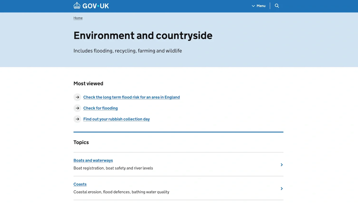
Example of GovUK website with good web colour contrast
Patagonia: Balances their earth-tone brand colours with strong contrast for all text. They use darker shades of their brand colours for text and lighter shades for backgrounds.

Example of Patagonia website demonstrating good web colour contrast
Mailchimp: Demonstrates how bright, fun brand colours can still be accessible. They use their famous yellow as an accent, not for text, and maintain excellent contrast throughout their interface.
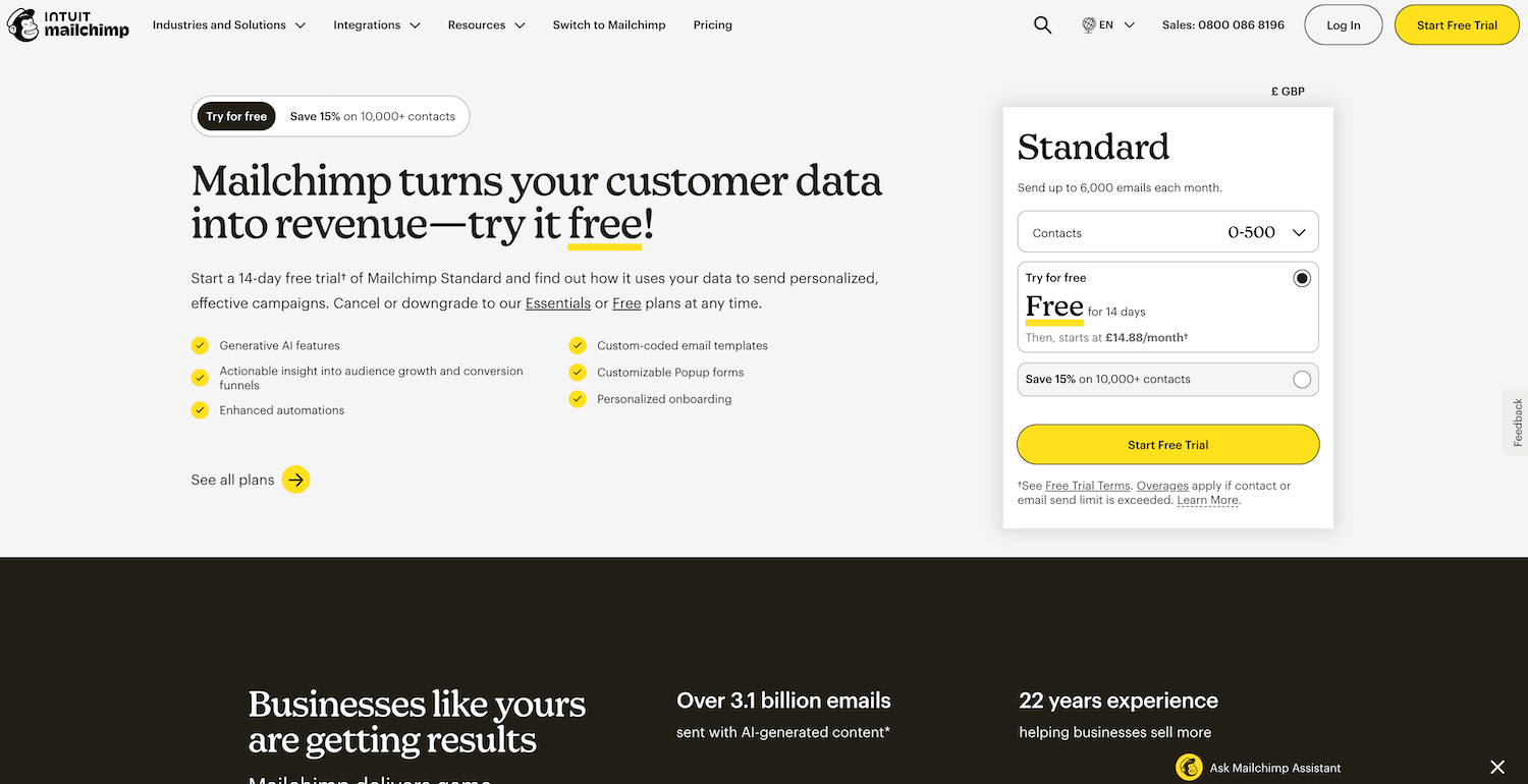
Good web colour contrast example from MailChimp
The Business Case: Why This Actually Matters
Beyond being the right thing to do, proper colour contrast has tangible business benefits:
SEO Benefits
Whilst Google doesn't have a specific ranking factor for contrast, accessibility improvements correlate with better SEO performance.
A comprehensive study by Semrush, AccessibilityChecker.org, and BuiltWith found that websites implementing accessibility solutions saw a 12% average increase in overall traffic, with 73% of that traffic coming from organic search.
You might like this blog post on
Legal Compliance
With 4,605 ADA lawsuits filed in the US in 2024 and the European Accessibility Act coming into force in 2025, accessibility compliance isn't optional anymore.
Colour contrast is one of the easiest accessibility issues to fix; don't let it be the thing that lands you in legal hot water.
Improved Conversion Rates
When people can actually read your content, they're more likely to engage with it.
Better readability means:
lower bounce rates
longer time on site,
and, ultimately, better conversion rates.
You're not leaving money on the table; you're making sure it's easy for people to find and use your services.
Your Free Resource: Contrast Checking Checklist
I've created a simple PDF checklist you can download that walks through every element on your website that needs contrast checking. It includes:
All text elements (headings, body text, captions)
Interactive elements (buttons, links, form fields)
Visual elements (icons, borders, focus indicators)
Recommended tools for each type of check
Quick reference guide for WCAG ratios
Takeaway: Start Where You Are
Look, I get it—this might feel overwhelming if you've just discovered your carefully chosen brand colours don't meet contrast requirements. But remember: you don't have to fix everything overnight.
Start with your most important pages: your homepage, your services page, and your contact form. Run them through the WebAIM Contrast Checker. Make the adjustments that matter most. Often, you'll find you only need to tweak things slightly—a shade darker here, a bit lighter there.
The key takeaway? Good colour contrast isn't about sacrificing your brand's visual identity. It's about making sure that identity reaches everyone who visits your website. It's about clarity over cleverness. It's about choosing to include rather than accidentally exclude.
Your website should work for everyone—because your business deserves to reach everyone. Let's make sure the world can actually see the brilliant work you're doing.
Need Help Making Your Website Accessible?
If you're feeling a bit wobbly about tackling this on your own, that's absolutely normal. Website accessibility can feel like navigating a maze, especially when you're trying to run your business at the same time.
I offer a Pro Website Audit with Strategy that includes a comprehensive accessibility review with specific recommendations for your Squarespace site (and other platforms). We'll look at colour contrast, yes, but also at the bigger picture of creating a website that truly works for everyone.
Get in touch via my contact form and let's chat about how I can help make your online presence not just beautiful, but accessible to everyone.
Frequently Asked Questions
Do all websites legally need to meet WCAG contrast requirements?
In the UK, the Equality Act 2010 requires websites to be accessible. In the US, whilst the ADA doesn't explicitly mention websites, courts have consistently ruled that websites are considered 'places of public accommodation' and must be accessible. WCAG 2.1 Level AA is the widely accepted standard for compliance in both regions.
Can I test contrast on my mobile phone?
Absolutely! The WebAIM Contrast Checker works brilliantly on mobile browsers. You can also download apps like 'Colour Contrast Analyser' for desktop and iOS. It lets you use your phone's camera to check contrast on the fly.
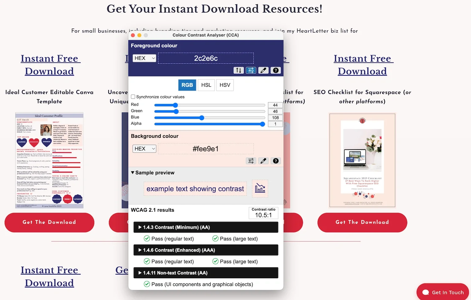
Example of using the web Colour Contrast Analyser via desktop or mobile
What if my logo doesn't meet contrast requirements?
Logos and logotypes are exempt from WCAG contrast requirements. However, this exception only applies to the actual logo itself, not to your general brand colours used throughout your website content.
How often should I check my website's contrast?
Check whenever you make design changes, add new content, or update your brand colours. I recommend a comprehensive accessibility audit (including contrast) at least annually, or whenever you do a major website refresh.
Are Squarespace templates automatically accessible?
Unfortunately, no. Whilst Squarespace has built-in accessibility features and some templates are better than others, none are automatically fully accessible out of the box. You'll need to actively review and adjust colours, add alt text, check heading structure, and more. The good news is that Squarespace makes these adjustments quite straightforward once you know what to look for.
Thanks 🌟 for being here, and if you’d like more tips, tools, and tricks [without the overwhelm], to help YOU grow your small business, I’d love to have you join my twice-monthly HeartBiz 💌 Letter.
Subscribe here for my Free downloads:
1. 5-Step Web Design Checklist PDF
2. Uncover Your Unique Selling Proposition USP
3. Ideal Customer editable Canva Template
4. SEO Checklist for all platforms (including Squarespace)
5. Is Your Website Holding You Back? A brand identity checklist
6. Small Business Web Maintenance Tracker. Keep up with regular tasks using my Notion template
7. Colour Contrast Checklist PDF