Breaking Down The Process For Creating My Logo
My New Logo
I really wanted to explain to you the ‘thinking’ and the ‘doing’ behind the creation of my new logo in case it might be helpful for you.
I don’t know about you but I always find it fascinating to see the breakdown of a process and the journey through to the conclusion and I thought you might find it interesting too.
Full logo
Secondary logo
Let’s face it, logos or icons, are a pretty big deal in this ultra-visual world we live in - after all, that final icon represents your biz!
Just think of the largest grossing companies in the UK such as Tesco, Barclays, Sky, Land Rover and in the USA, companies like Amazon, Nike and Apple and you’re probably already aware of their logos without perhaps consciously wanting to remember them! ;)
My logo works for me in a number of ways:
The J is obviously the first letter of Jane and so can be easily remembered.
The leaves represent growth, abundance and flourishing. Also, ‘growth’ in the form of holistic learning and hopefully, growth for your flourishing and sustainable business.
The ‘J’ is a little ‘wonky’ and this represents the imperfection of life. It’s a celebration of authenticity, doing your best and being true to your business and life.
font - The font type font for the ‘J’ is modern, quirky, creative and imperfect. The font for the business name and description is modern, friendly, non-fussy or complicated.
brand colours - modern, warm, friendly, creative, representative of colours that are calming with a little injection of colour in one of the leaves.
Preparation
Below is a breakdown of my thought and creative process for my new logo.
Before I began though, you guessed it, I grabbed something to write with, some paper and turned off all devices - yes, I needed some serious headspace!
The Questions I asked myself to get to the heart of the matter:
1. What are the goals?
Firstly, I began thinking about what I wanted my logo/icon to achieve and represent. My answers were to inform, inspire, encourage and activate.
2. Who is my audience?
My audience is ‘usually’ female small business owners who are often in midlife. They are warm, caring and passionate about their business. They are looking for someone who is both creative and techy. Someone who is strategic and also kindhearted.
3. What is the core message of my logo in one sentence?
This is vital and so I wrote various iterations and settled on the sentence below that felt really fitting for me:
I’m creative, dependable, warm-hearted, and professional.
“Websites that make YOU look good so that you can attract and convert more dream clients.”
The MOSCOW Method
Next, I followed the MOSCOW prioritisation technique as described by the fantastic Willemien Brand and her book Visual Thinking (here’s the link for her innovative business, Buro Brand).
MoSCoW
M - MUST TELL - My name, is Jane Hinchliffe. A clear understanding of what I do. My creativity.
S - SHOULD TELL - Feminity. My deep desire is to help small businesses grow, spread their light, prosper and in turn, help support their families.
C - COULD TELL - My subtitle - ‘websites & branding’.
W - WON’T TELL - Specifics of how I can help ie. website design, illustration, ecourse launching, branding and marketing etc.
Visuals
You can imagine that I was chomping at the bit to start doodling and sketching ideas out. Again, there was some structure but I also let my imagination soar - it was fun!
Words and Images That Resonated
Here’s a flavour of just some of the words and images that I conjured up as a result of the work carried out so far.
bulb
plant
seed
flourish
talents/gifts
tree
hands
leaves
candle
shine
Digital Drawing/Painting Experimentation
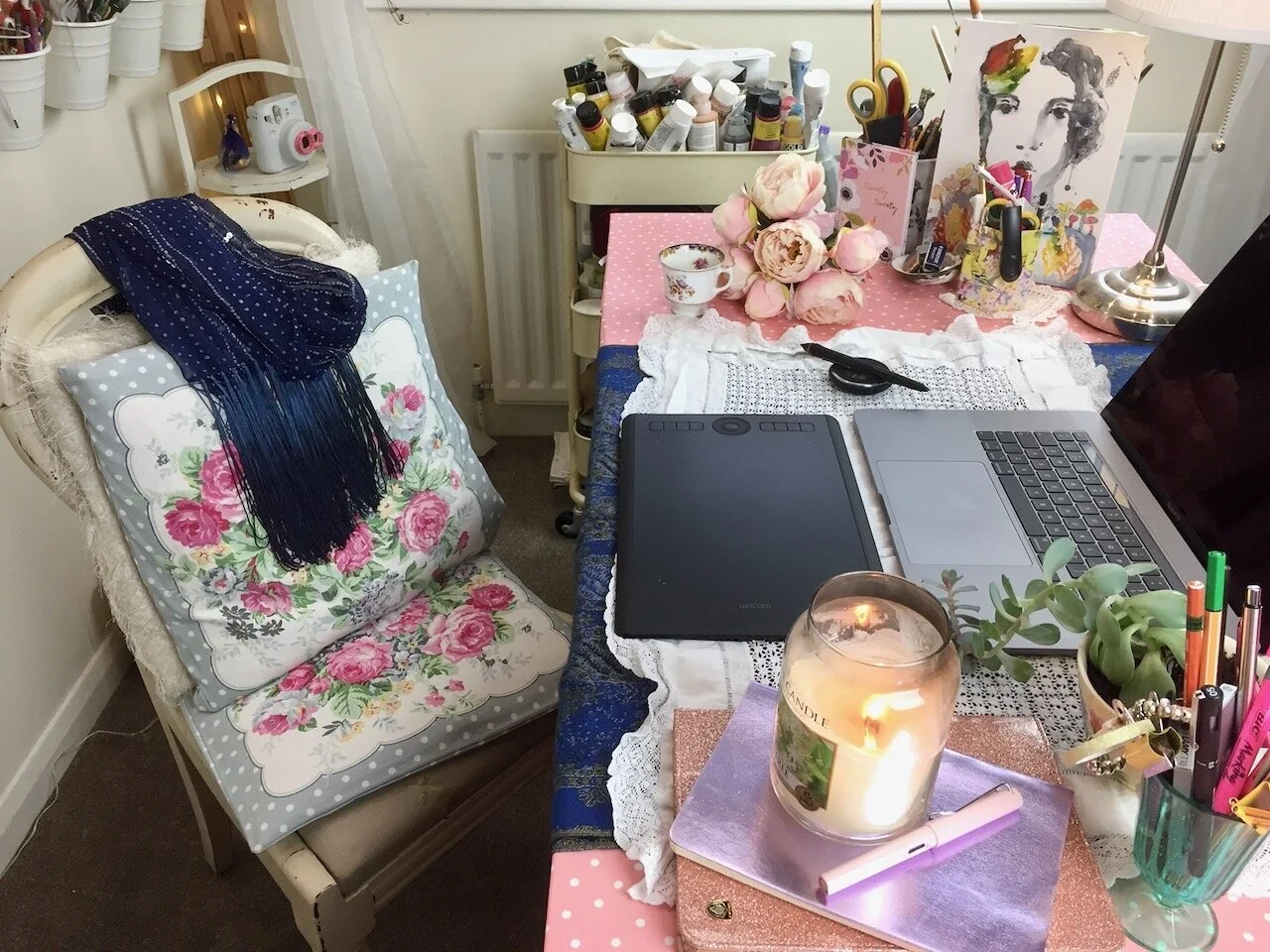
I was very happy with the leaf idea but still wasn’t fully satisfied with my overall image and so decided to go digital with my fabulous Wacom Intuos Pro.
My Wacom set up
Text
Then, I went on the hunt for fonts that to me reflect my heart behind the biz, my brand and the digital drawing I’d created. Needless to say, finding fonts is always a fun process and has me in my ‘happy place’.
Favicon
Next up, I created a favicon aka browser icon using my brand colours.
Finishing Up
Lastly, I created a transparent and white background version of my logo and hey presto, it’s done.
Conclusion
I’m so glad that I went through this process because even though it’s taken time, thought and creative input, I genuinely feel this logo truly reflects my business and that’s a win for me.
So, I hope this process sheds a little bit of light, on how I developed my initial thoughts, ideas, sketches etc. into the finished logo.
Over to you, what has worked for you when designing and creating your logo? If you had a designer create yours for you, did you find it easy to convey your needs/wants during the process?
When working with website design clients, I often create also their logos, business cards etc. If you need a new website or a redesign, please book a free discovery call to chat through your project needs and goals and see if we are a good fit.
Pin for later.


