
Website Design - Top 11 Most Common Mistakes For Small Businesses

Are you driving visitors away from your site or attracting them?
Your website is your storefront to the world. It's your most prized and vital asset for your business and needs to look the part.
Web design can be thought of as an art form. Like a finished painting, your website is trying to convey an experience, and it's doing the same thing.
“You have just 3 seconds to make an impression otherwise a visitor will click away.”
The great news is that platforms are making it easier than ever before to create a professional-looking website. As a web designer, my platform of choice is Squarespace and I certainly don’t regret moving over from WordPress for one moment but there’s still a variety of mistakes you can make to your brand and its credibility with a website that’s below par and I want to help you avoid these pitfalls.
Here are some of my suggestions to ensure your website performs at its very best:
1. Navigation Menu
Keeping your navigation menu at the very top and in a straight line works best, as opposed to down the side, or within a shape. Show the most important items either first or last - this is called the serial position effect. Take care with drop-down menus - they can be annoying, don’t add too many links. Consider using your footer for links that have secondary importance.

2. Typography (Fonts)
Typography communicates so much.

Use fonts that match the mood and personality of your brand. The hand-writing font to the right has a relaxed and friendly feel to it which mirrors the vibe of the website and what she offers.
Make sure that the fonts you use are easy to read.
Ask yourself, does the font make sense for your brand? For example, a flowery font might not be appropriate if you’re going for a professional look - let’s say you’re a bookkeeper for instance. Adding in a second font can add impact and spark.
Consider choosing fonts with built-in flexibility for variation and as a way to break up text for added interest. For example, a font that looks great when italicised, in caps etc. For continuity, maintain your chosen fonts across your site.
3. Pop Up’s
Pop up’s are great for capturing emails but be careful of overly large pop-ups that cover your entire page, especially when you can’t find a way to click off them!
Bonus tip: Check your pop-up for mobile responsiveness.
4. Responsive Design & User Experience
Responsive design is a must for a positive user experience.
Your design should resize automatically across different formats for most website platforms. Approximately 60% of users are on a mobile device and this is proving to be an upward trend. It’s so important, that Google will penalise sites that aren’t responsive.
Luckily for me as a website designer, all sites on Squarespace 7.1 have a new (launched July 2022) editing experience called Fluid Engine. This was and is great news. Why? Because it means there are no longer any barriers to designing. You can now layer images, add background colour and resize blocks using a drag-and-drop editor. There are separate editing views for mobile and desktop - meaning you can design your site just the way you like it!
An indication that your site isn’t responsive is when your images or text shows up as too small/large. Or, when text is cut off and forced onto the next line.
Bonus Tip: Talking about user experience, don’t forget to check for any broken links on your site.
5. Images
Imagery sets the scene for your content & brand.
Images can help describe a mood, teach something, give more information on a product, evoke a depth of feeling, tell a story, and build a relationship with the viewer.
Whether it’s photos, illustrations or digital artwork, finding ideal images for your site can be challenging especially if you don’t have a particularly visual business such as a coach, writer, or bookkeeper.
However, be careful of being over-reliant on generic stock photography as it can conflict with the essence of your brand. You’ll find some stock photography sites on my Business Tools page.
To reduce cost, take the photos yourself and reserve a professional photographer for key photos. Oh and animations (as long as they don’t compromise your site’s load time) and gifs are fine if they work with your brand but don’t go overboard.
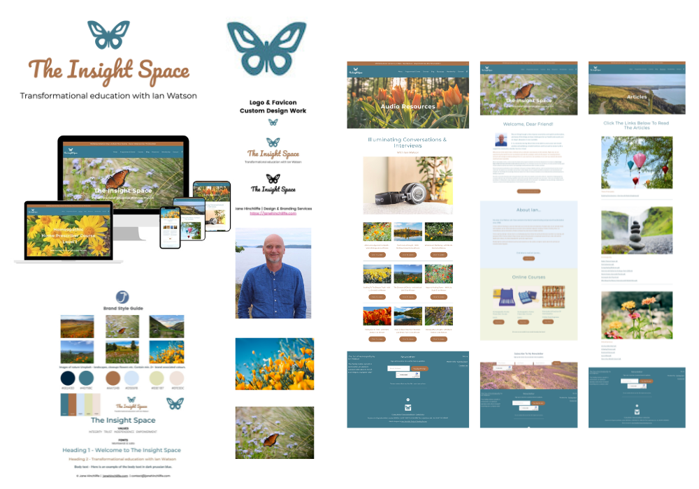
Client website - imagery, colours, fonts, logo, words - all working together in harmony.
6. White Space
Less is more.
White space is space that is left deliberately between elements on a page.
They help the visitor navigate content on your website and set the mood and pace. Finding a balance between your text, images and space around these elements is vital - you never want to suffocate.
When you achieve a balance, your visitor won’t feel overwhelmed and there’ll be a natural flow to your content which will encourage your visitors to explore more. There’s space for the content to ‘breathe’ but not so much space as the visitor can feel lost and unsure where to go next.
7. Arranging Text
People scan content.
I’d recommend avoiding full-width text that can feel tiring to read, the overuse of caps, and too many sentences bunched together.
Forget what you learnt at school regarding paragraphs and instead, split long sentences up and start new paragraphs wherever possible.
Add:
bullet points
italic lettering,
subtitles etc.
8. Favicon
A favicon is the little square icon you see in a web browser.
It’s a vital branding asset for your website.
It surprises me how many websites don’t have one. When you consider the majority of people have many tabs open at once (hand raised 😅), it helps to have a visual reminder of that site.
9. Colour
Colour is the lifeblood of design.
Your chosen colour palette is a great tool to help you express your brand and of course, there is so much research on the psychology of colour.
The right colours used in the right place can elevate your design and help you to connect with your audience.
Notice the interaction of your chosen brand colours with each other, with your logo and with your fonts.
Bonus Tip: Be creative with your colours, do they reflect the personality of your business?
10. Hierarchy
By using hierarchy, you can show the importance of elements on your website.
You do this by using typography and colour.
Hierarchy helps lead the visitor around your content to the messages you most want to share. When you do this, it actually makes for a more enjoyable and worthwhile interaction for your audience.
11. Consistency
Visual order is pleasing to the eye.
It’s helpful to have some consistency within your website so that certain basics are similar throughout. For instance, your h1 headings might always be centred, call-to-action buttons are in a certain colour, and there’s always a ‘hero’ (main) banner image on every page.
Conclusion
Remember, a great website is more than just some text and buttons that lead to a checkout page. Consumers are savvy; they want a website that speaks to them directly, works quickly, answers their questions and earns their trust.
I hope my suggestions have been helpful, and that you can start implementing them right away. If you have any questions or comments, I would love to hear from you.
I understand that there are many moving parts to a website so if you’d like some help, either with a website audit, Squarespace training, a re-design or, a brand new website, please click the link below and fill out my contact form. I’m always happy to help.
Why not save this post for later & pin it 👇🏼.
